Our goal is to create a turnkey solution to exploring cities.
As of now, ridesharing users struggle to compare travel estimates of costs between competing venues and often have to use multiple applications to find and assess potential destinations.
Whether it is exploring a new city or discovering a new spot in town, by integrating crowd-sourced reviews of locations along with travel and price estimates, Uber can create a seamless and efficient travel experience.
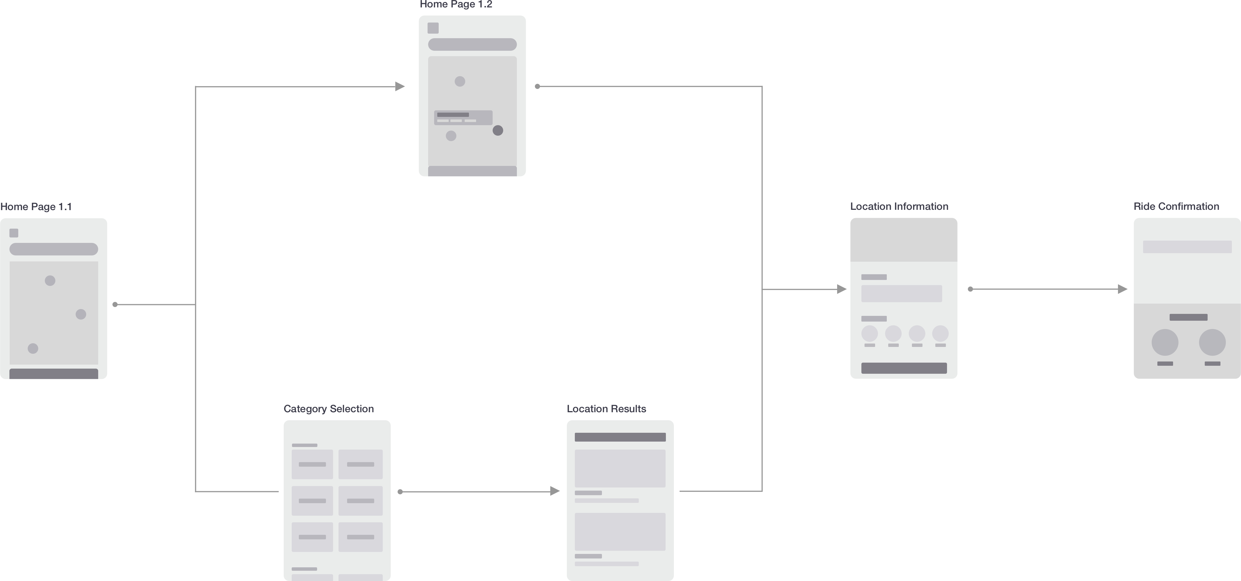
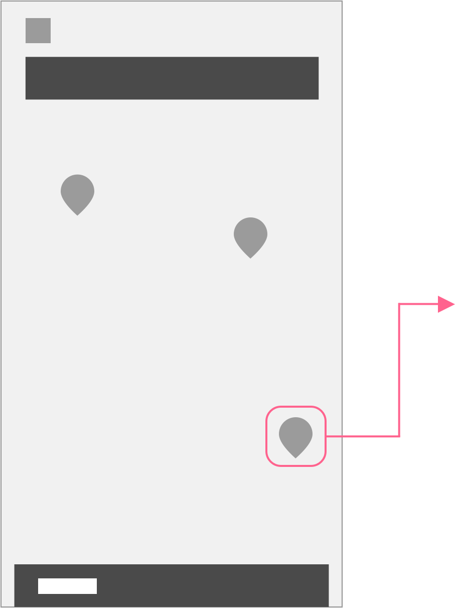
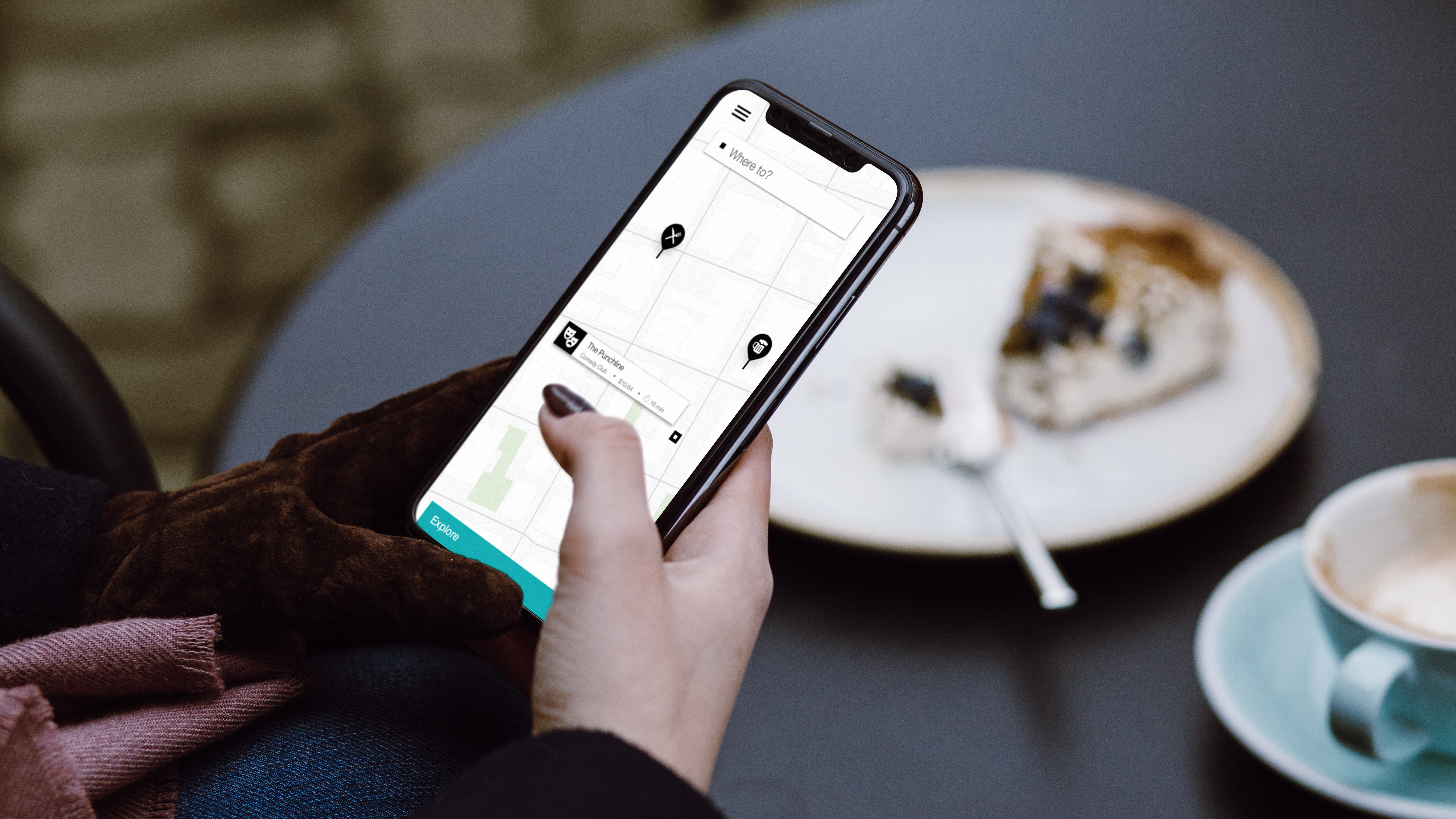
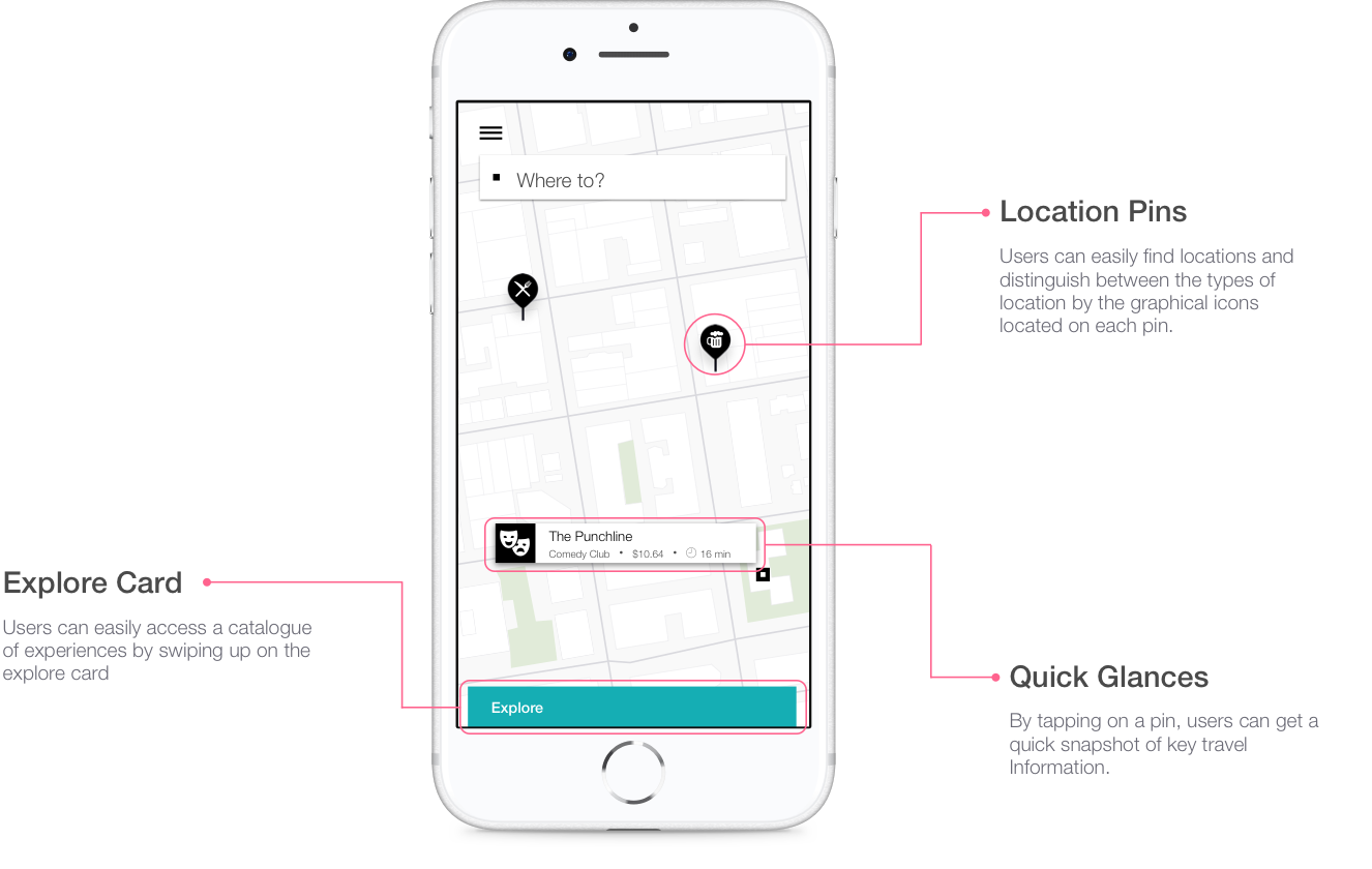
Upon opening the app, users can scroll around the map to find locations of interest in areas they are looking to explore.
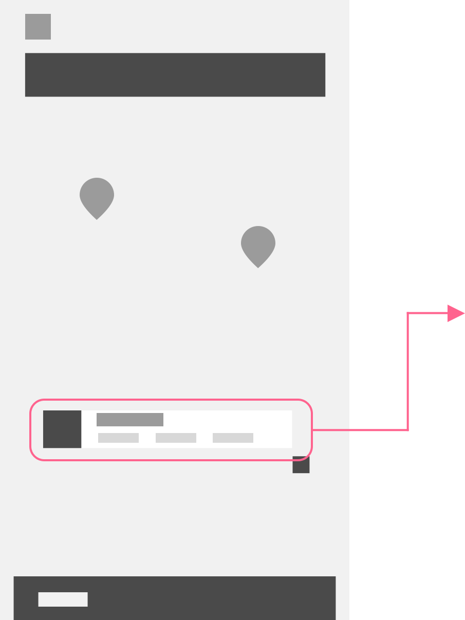
When a user taps on a pin, it expands to provide the user with a fare approximation and an estimation of travel time.
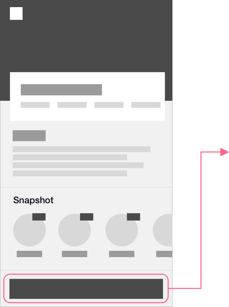
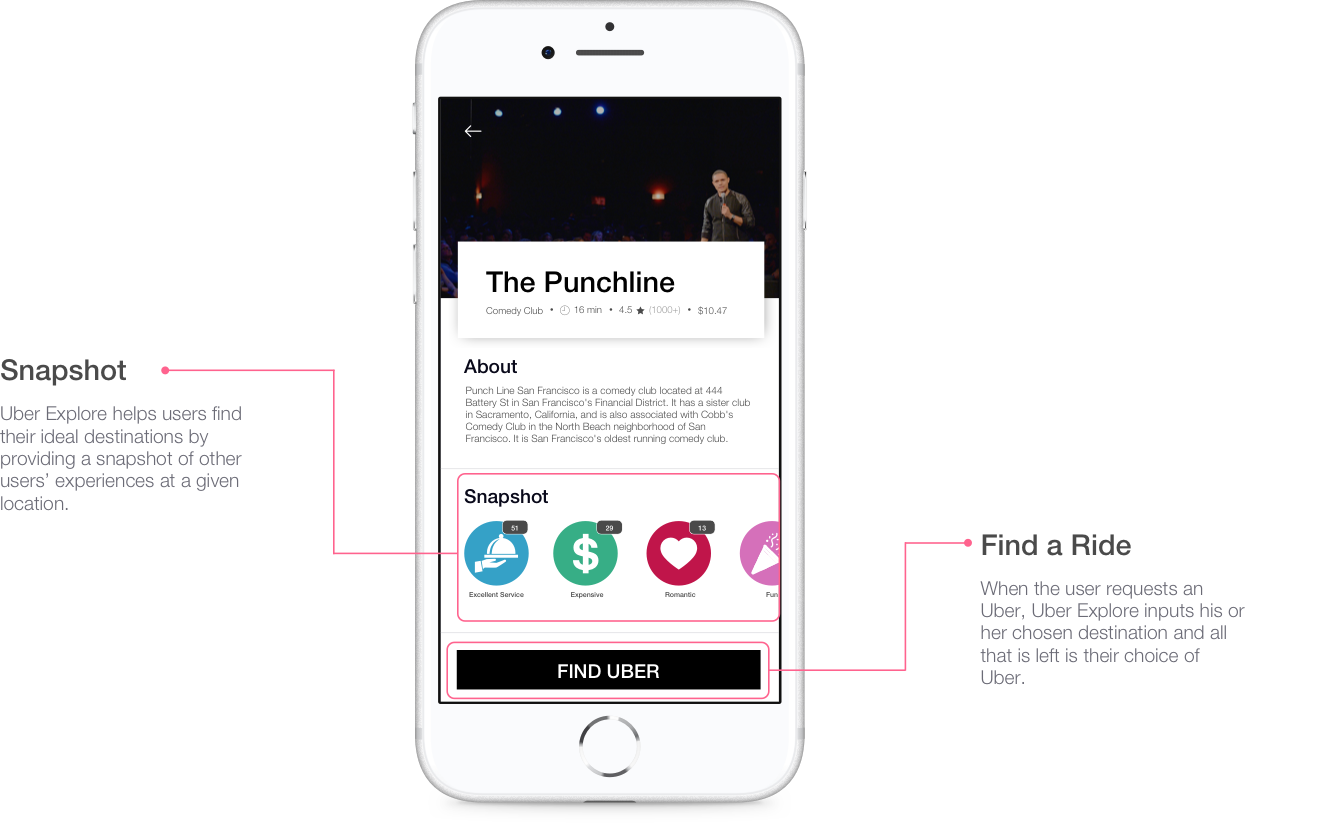
By tapping on the expanded pin, the user is taken to the location’s information page. The information page gives a brief description of the venue, a snapshot of what other users have been saying, and an option to take an Uber immediately to the location.
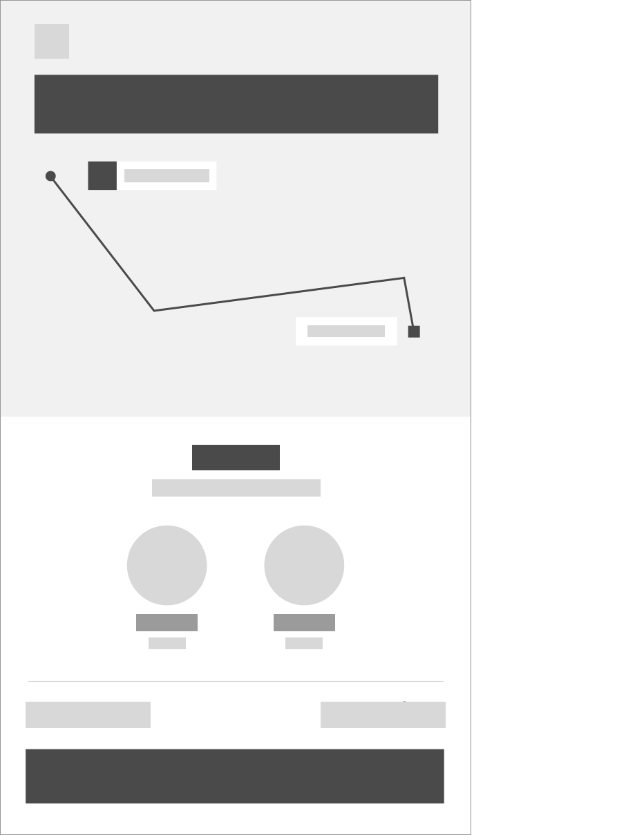
After a user presses “Find Uber”, the Uber app inputs the address as the destination. The user can then request their preferred type of Uber and set off on his or her adventure.
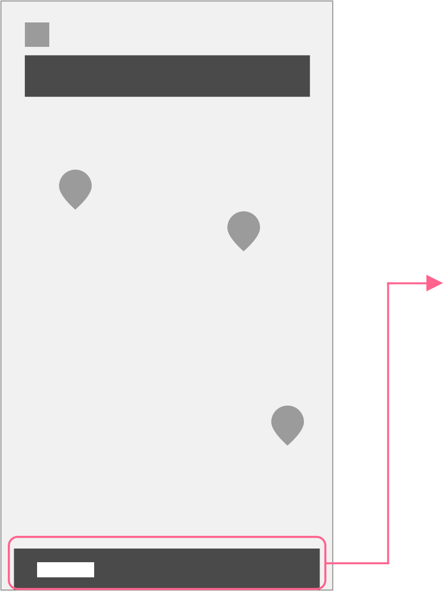
Upon opening the app, if the user has a desination in mind, he or she can put it into the search bar or could open up the explore section.
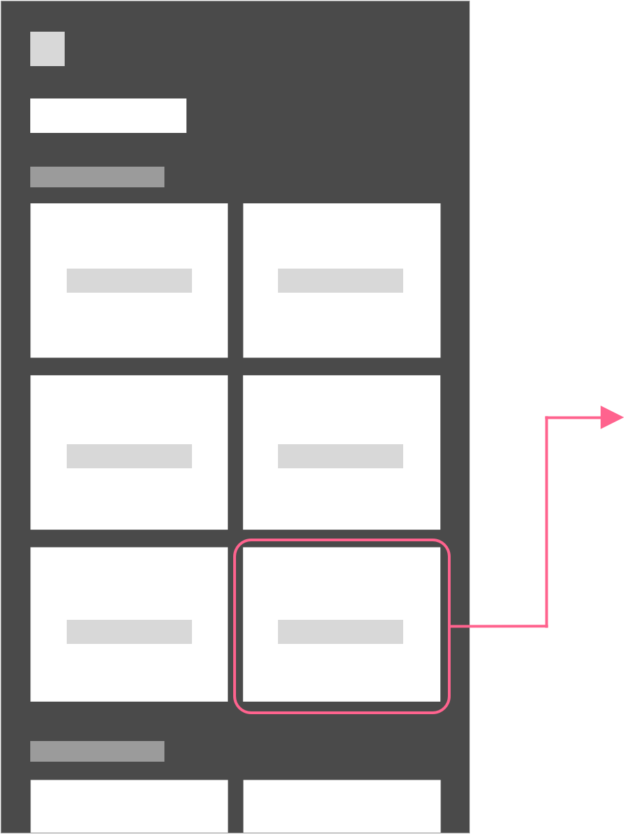
With a swipe up, the user can jump to the category selection page. Locations are organized into categories shaped around experiences.
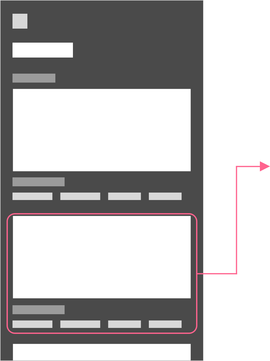
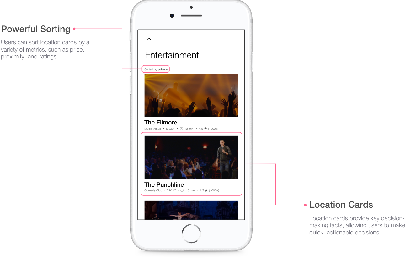
After selecting a category, users can quickly find a location that meets their seach criteria by filtering or sorting by type of venue, cost, distance, or rating.
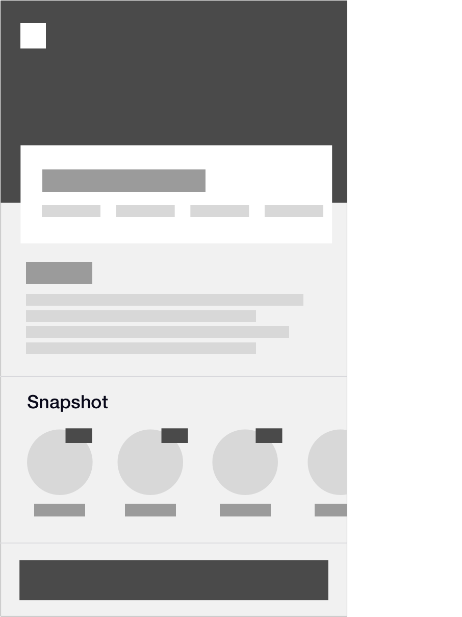
After choosing a location, the user is taken to its information page. The information page gives a brief description of the venue, a snapshot of what other users have been saying, and an option to take an Uber immediately to the location.
By overlaying the Uber map with interactive pins and an Explore Card, Uber Explore does more than provide users rides, it gives users the chance to choose their own adventure. With just a tap on a pin or a simple swipe upwards, Uber Explore unlocks a world of experiences.
Whatever the mood or goal, users can choose between Uber Explore’s many categories to find their perfect experience.
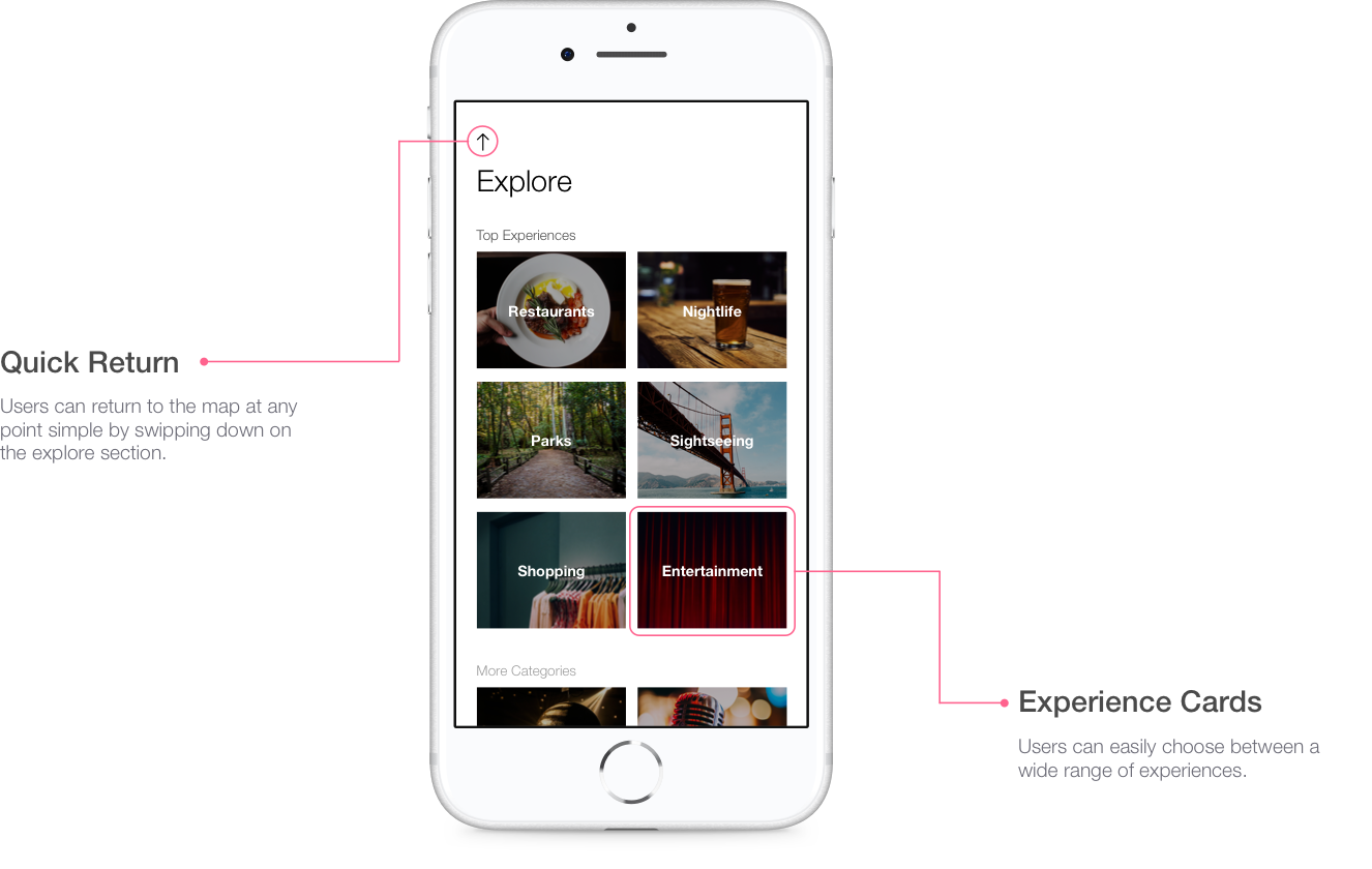
Specifically tailored to satisfy user needs, Uber Explore allows users to sort location cards by price, proximity, and rating. By providing key decision-making facts on the cards, users can easily and quickly make actionable decisions.
Uber Explore does more than give a description of potential destinations. At a glance, users can contribute and pull from categorized ratings to find their ideal destination.
