
90% of a house's value is determined by its location and build, accessible through public record. The remaining 10% is determined by its home features (e.g. island tables, granite countertops, and hardwood floors), accessible only to homeowners. By having users submit this data, REX can calculate full house values and provide superior listings to those given by real estate agents.
The target users of the REX home appraisal app are home sellers and buyers who wish to avoid the cost of a real estate agent. A key differentiator of this user group is that they are often unaware of the nuances of home appraisal and will likely need to be guided along the steps of home valuation.
I worked on a team comprised of two designers and two developers. My co-designer and I built the product from the bottom up. We engaged in all facets of design including: user task flows, interaction, visual, product, and prototyping. We conducted user research via interviews and participatory design in order to address both user behavior and attitudes.
We started the design process by interviewing home buyers/sellers and real estate agents. We successfully identified the key buyer/seller concern: the buyers/sellers did not know which home features had the biggest impact on their home valuations. After meeting with the real estate agents, it became clear to us that the process was very nuanced. Each home feature could have a wide range of variations, each with a drastically different effect on the sale price of a house. Consequently, we needed to find a way to walk the users through the process and collect serviceable data for the REX appraisers to interpret.
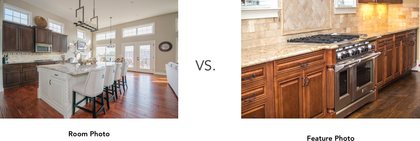
As the REX appraisers’ quality of analysis depended on the quality of user-submitted photographs and corresponding tags, we identified the key design challenge to be the collection and clean presentation of home feature data. To tackle this challenge, we focused primarily on the user-submitted photographs and secondarily on the corresponding tags. At first we debated the possible content of the photos: “Should the user take a photo of a room or of a home feature?” After discussing the various pros and cons, we concluded that although taking a photo of each room in the house would reduce the number of photos taken by users, the home features would be harder to discern within the photograph of the room and the tags could easily be confused. Limiting each photo to a singular feature was the better option.
Now that we had determined the desired content, my team and I needed to break down the data collection process in a way that would ensure users took photos of the right items, the photos themselves were of high quality, and relevant information on the item was collected. We broke the process down into three easy steps: sort, snap, and tag.
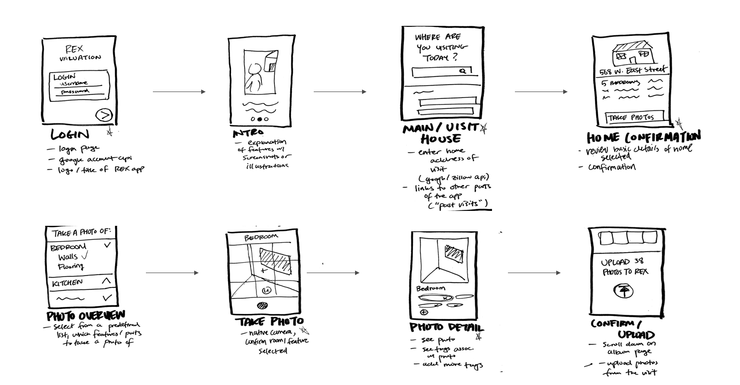
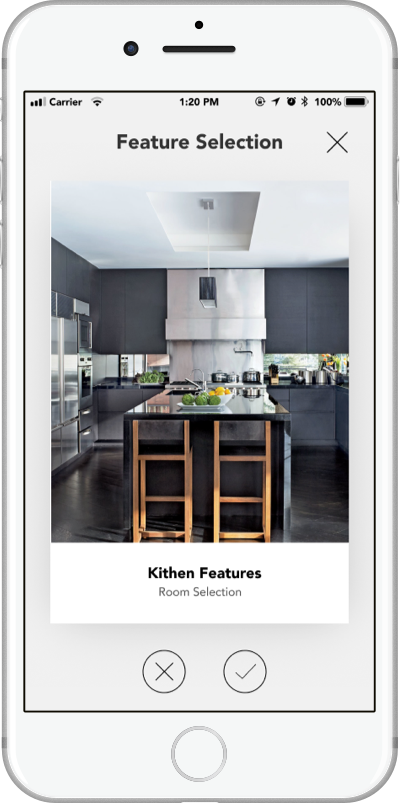
As every home is different, we needed to find an efficient way for users to know which features are worth taking a photo of. We liked the idea of creating a check-list of home features, so users could easily visualize what needed to be done; however, we were then faced with the issue of what would go on the list. With thousands of variants on home builds and the plethora of modifications, upgrades, and build materials, creating a one-size fits all checklist would be impossible. After a couple of brainstorming sessions, we realized that the user had to build the list. A few iterations later, we settled on creating a Tinder-like sorting mechanism populated with home features. The swiping mechanism would allow users to quickly create an itemized list of the valuable features of the home, and since each card would have a photo of the feature, users would know how to identify the feature, despite not knowing the name, or vice versa.
After testing our initial prototype, some users raised concerns about the number of cards they would have to swipe through. To streamline the process further, we decided to add a level of hierarchy to the cards. By having “room cards”, the user could avoid having to say no to all the potential features in a room. For example, if the user said no to having any kitchen upgrades, they would avoid having to say no to each individual feature.
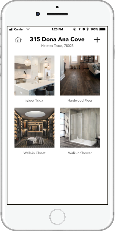
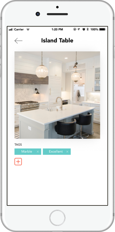
We took the features that were collected during the sort phase and created a feature dashboard. The dashboard is essentially a visual checklist so users can easily see what they need to take a photo of. Each feature card comes with an example photo in case the user forgot what the item looked like.
We spoke to real estate agents to get a view into the appraisal process, and they stressed the importance of correctly classifying the information, as each feature’s build and condition (which have the biggest impact on the value of the feature) would be hard to discern from a photo. As a result, we need to find a simple way for users to add this data to their. Since most homes would have several to potentially dozens of features, my team and I wanted to make this process as frictionless as possible. My team and I spend some time on The question of when do you ask the users for more information?
I developed a Proto.io prototype of a user appraising their house. The prototype goes through the entire process from sort, to snap, to tag.